Last year, the Office of Strategic Communication got word of a renovation of our above-the-bookstore space in Library Mall. Once complete, we were left with a fully rebuilt office — and fully blank walls.
As UW–Madison’s central marketing and strategic communication team, we’re responsible for defining and expressing the brand across the university. But our own workspace didn’t yet reflect that fact.
We set out to change that.
The challenges
Budget
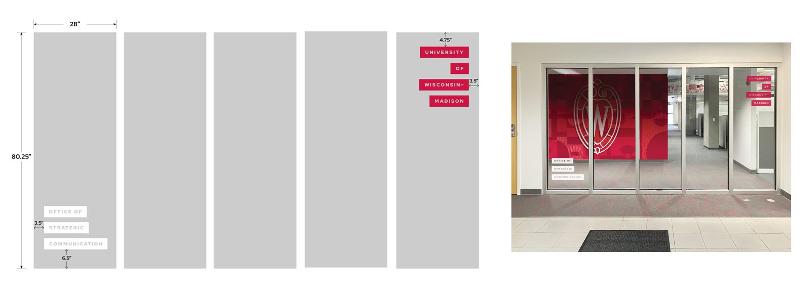
Our modest budget was built into the overall construction costs, so we had to be intentional about every choice. This environmental design is not simply decorative; it also needs to serve important functional purposes, including clear identification for our office, meeting spaces, conference rooms, and way finding throughout the suite.
Time
Once the physical space was renovated, there was no time to waste. We knew we needed a clear plan ready the moment it was go-time, to minimize disruption. To keep the timeline moving, we handled the strategy, content development, and the project coordination ourselves, allowing us to make decisions quickly, streamline approvals, and maximize every available hour.
Humans
The office space accommodates nearly 50 people who work across the fields of marketing and communication. People need to be able to take photos, do research, collaborate, and make sales calls in the space. In addition, people have different light, sound, and overall aesthetic preferences. And in a space full of creatives, those preferences come in hot.
So how do you design a cohesive environment for a group with strong opinions, competing needs, and limited resources? You build a winning design strategy.
The approach
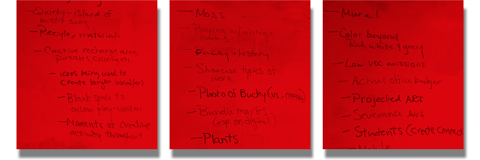
Start with behavior. We approached the space as we would any brand system: starting with questions, not aesthetics. Through a collaborative working session, we mapped how the brand should show up not just visually, but behaviorally. On other words, how should it feel to work here?
We discussed most-loved places on campus, working needs, and tonal and visual preferences. The brainstorm brought to light competing assumptions about the space (and workplaces in general).
From those tensions, a clear strategy emerged.
The strategy
Embrace the tension. During this research and brainstorming phase, staff consistently expressed needs that appeared to be in tension with one another: calm, reflective spaces but also lively, energetic environments. Appreciation for history, but with a forward-looking vibe. Institutionally recognizable, but not stiff. What to do?
Rather than forcing a single aesthetic solution, we embraced the tension. We divided the office into design zones, with each area offering a different visual and emotional experience. Individual designers worked on specific spaces, interpreting the UW–Madison brand in distinct ways. This allowed for creative exploration across materials, styles, and techniques while still maintaining a shared visual foundation.
Each area feels unique in tone and execution. Together, they read as a cohesive system.
The results
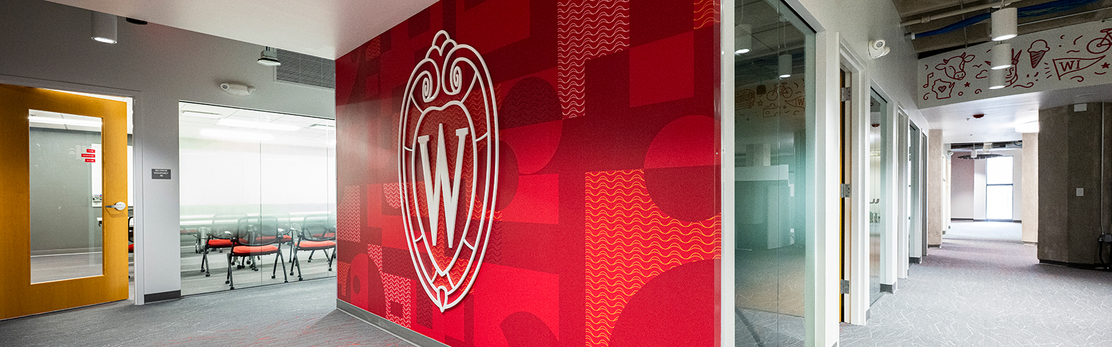
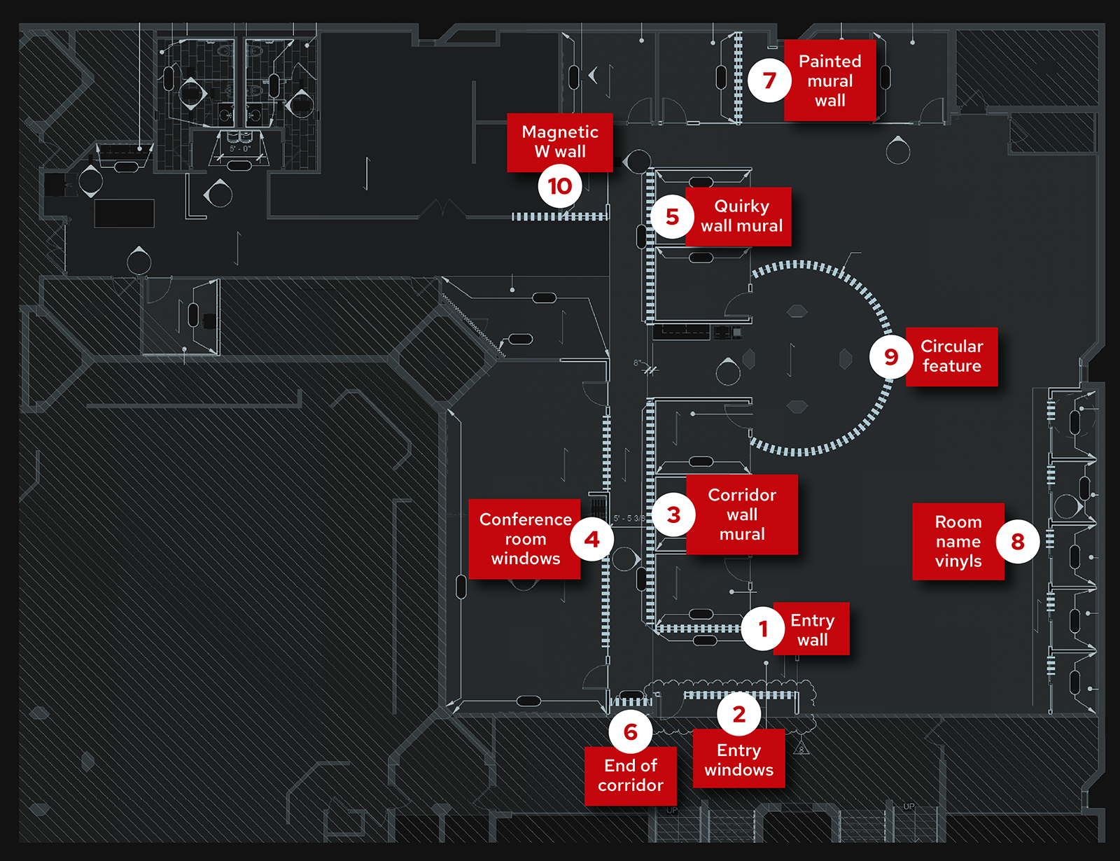
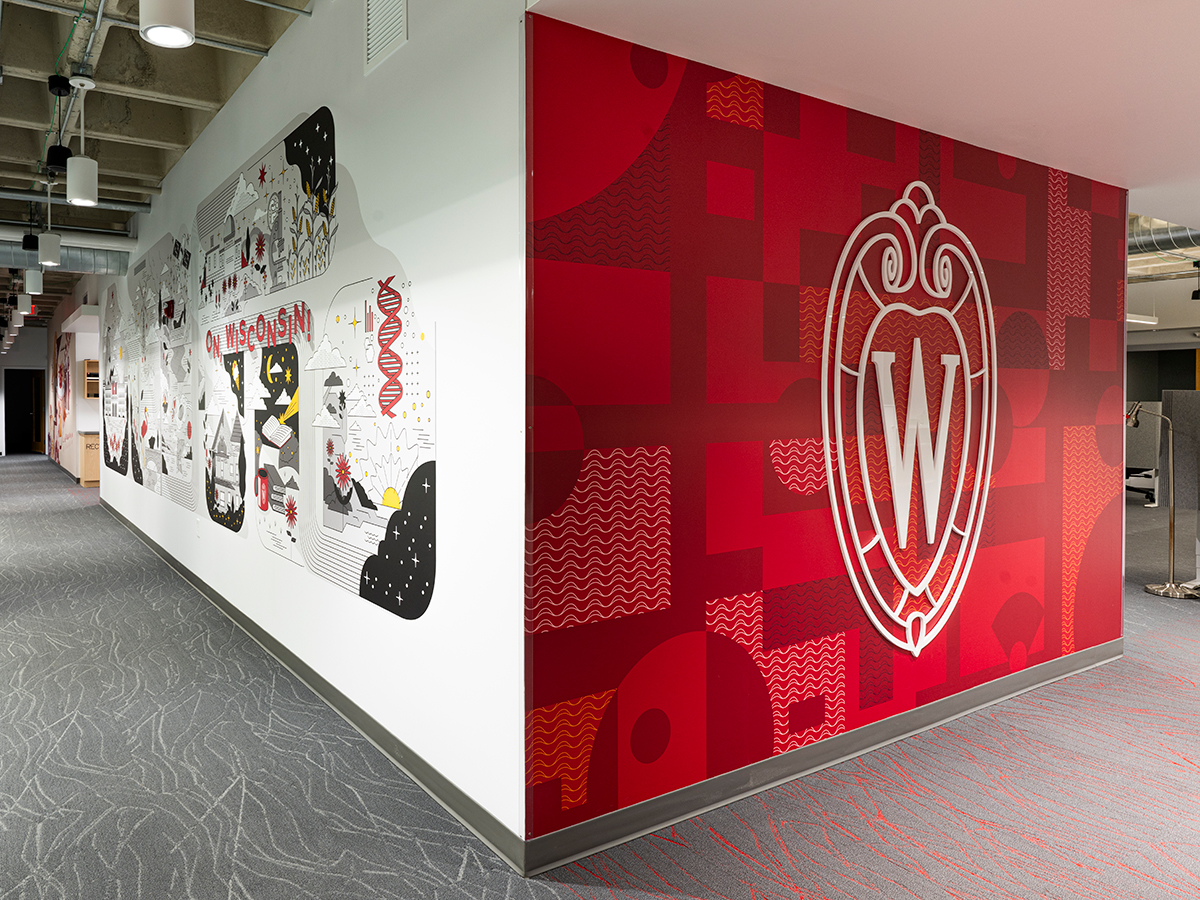
The iconic entry
As the office entry point, it was important to highlight the UW–Madison brand, placing the crest front and center. At the same time, we introduced visual interest connected to UW in less literal ways: the pattern behind the crest references our intramural fields on campus as seen from a drone, as well as those iconic black architectural elements on the outside of Sewell Social Sciences building.
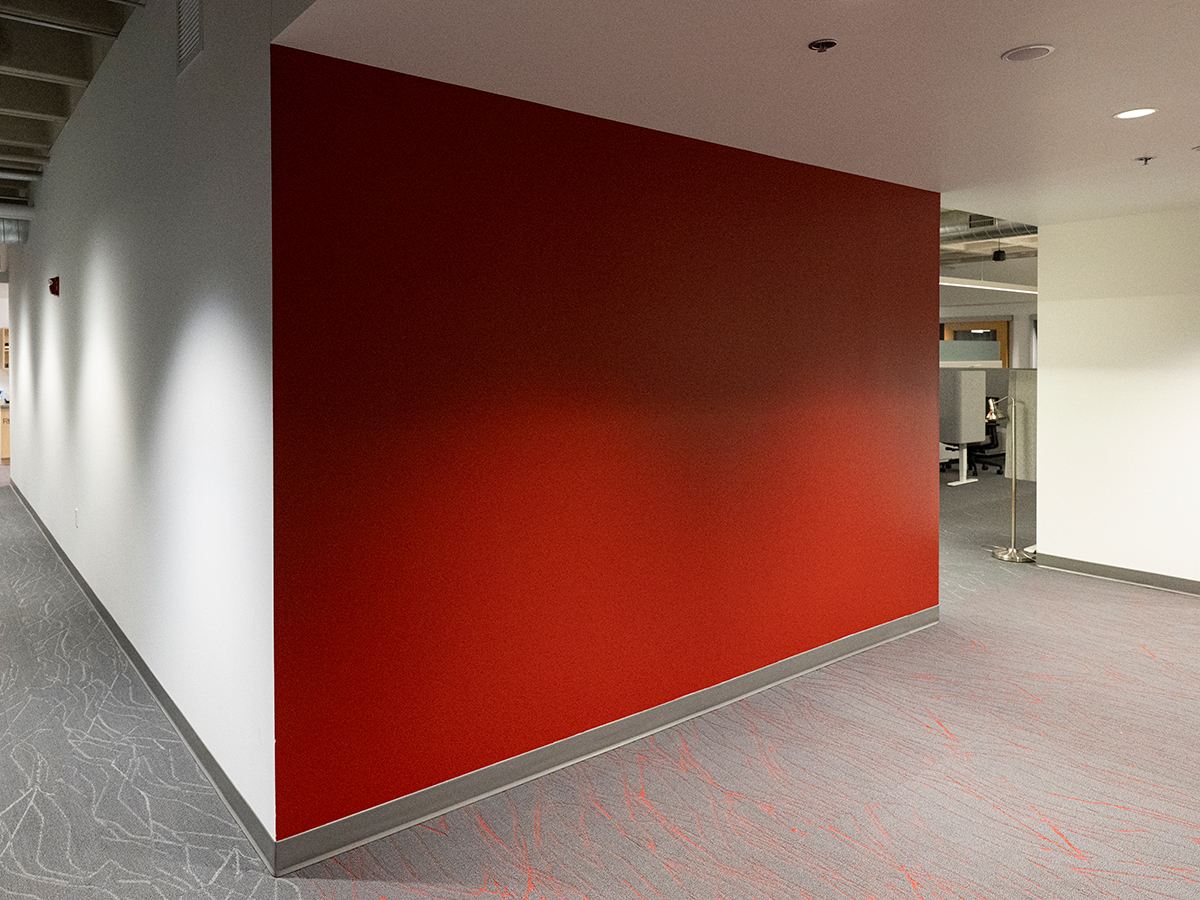
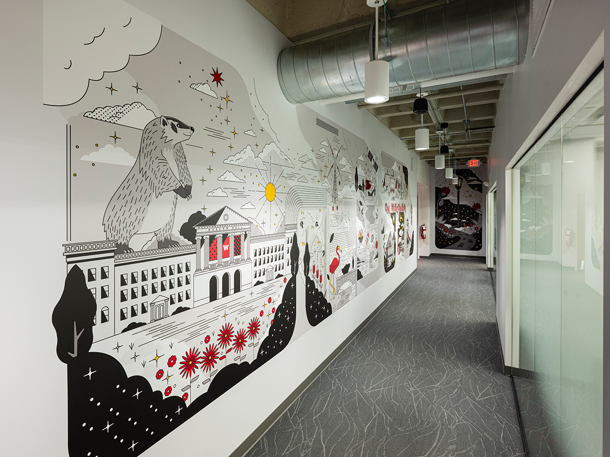
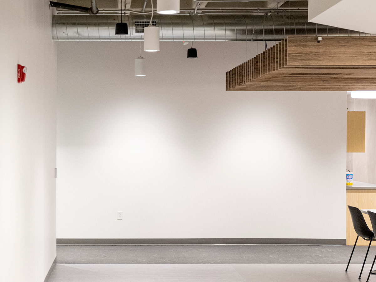
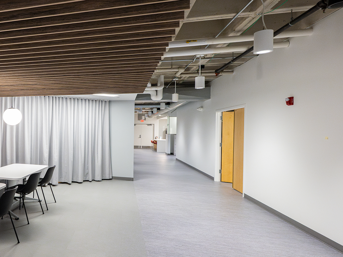
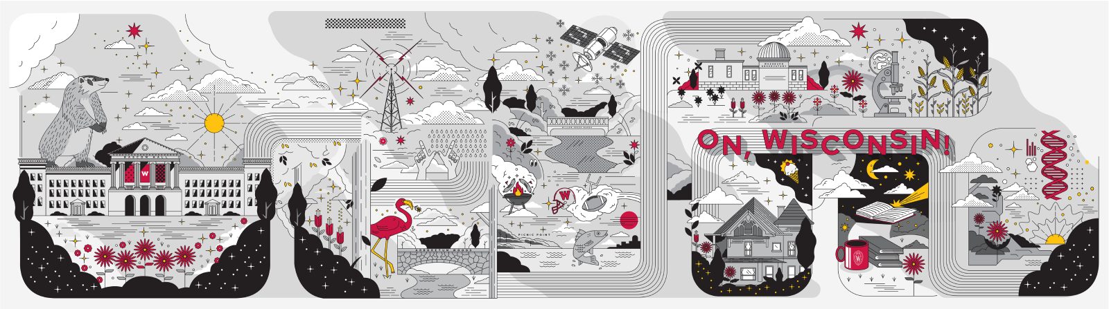
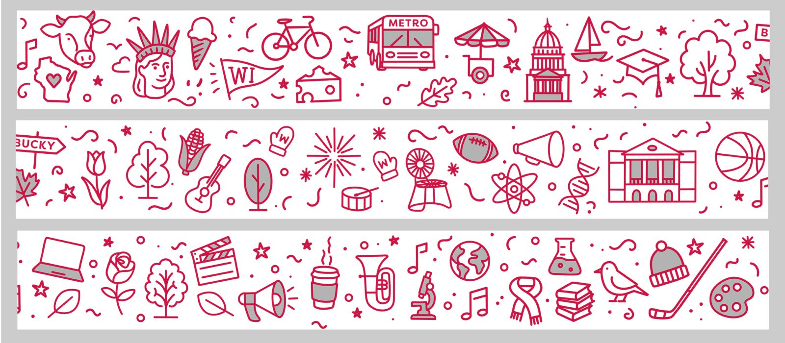
The calm and focused corridor
The mural uses simple shapes and mostly gray tones with red highlights to create a calm and focused feel, especially near meeting rooms. Visuals reference a wide array of UW locations, signature accomplishments, and environmental elements. The effect is countless moments of interest, wit, and wonder, without visual clutter.
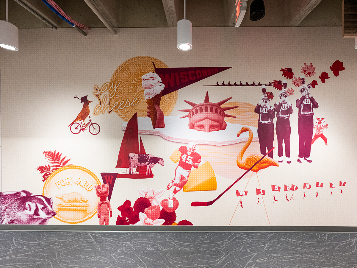
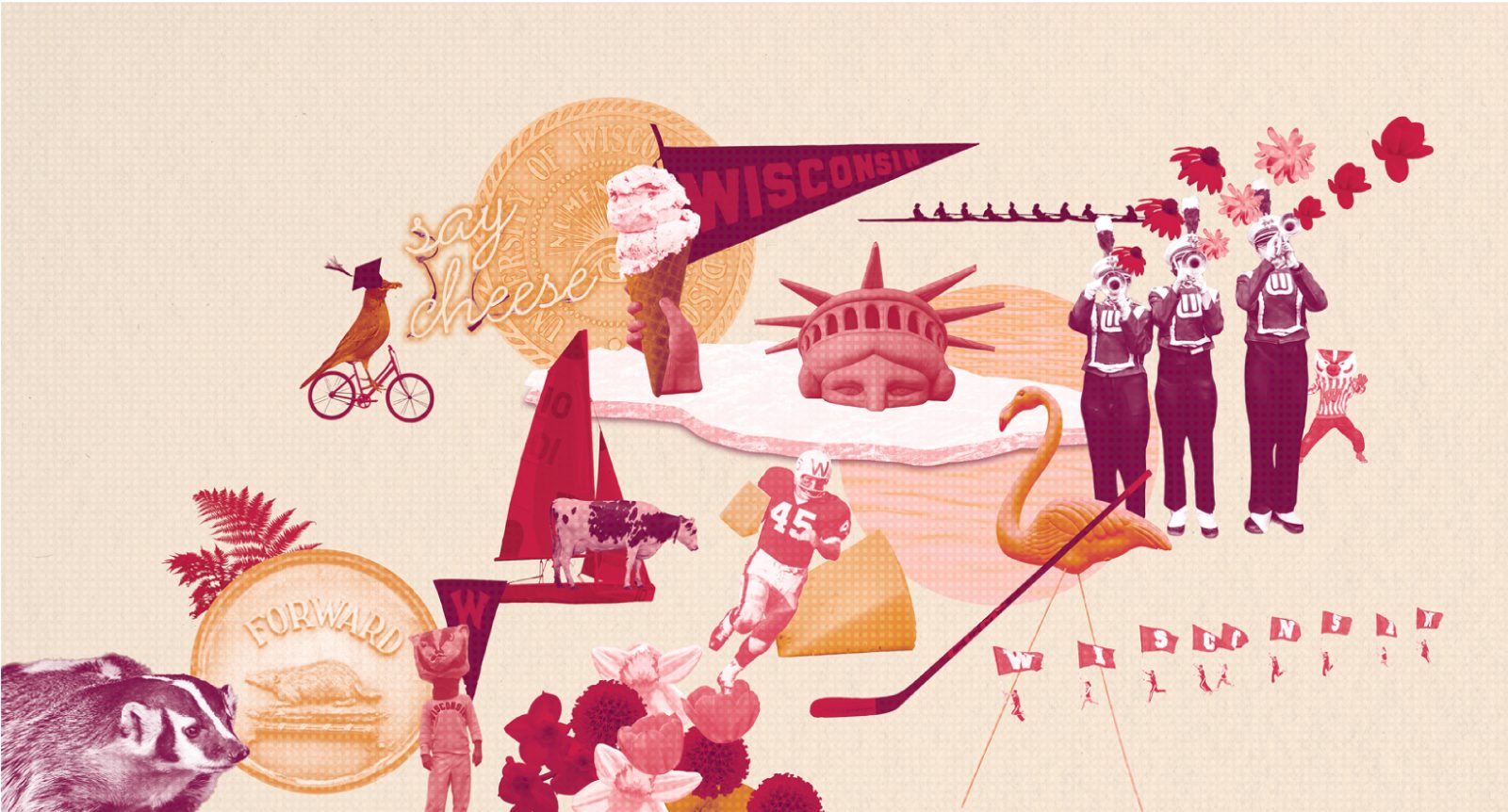
The quirky wall
Playfulness is part of our culture. And the design of this wall leans into it, juxtaposing iconic UW elements in unexpected, humorous ways. The result is a visual expression of the UW brand personality: smart, fun, and distinctly ours.
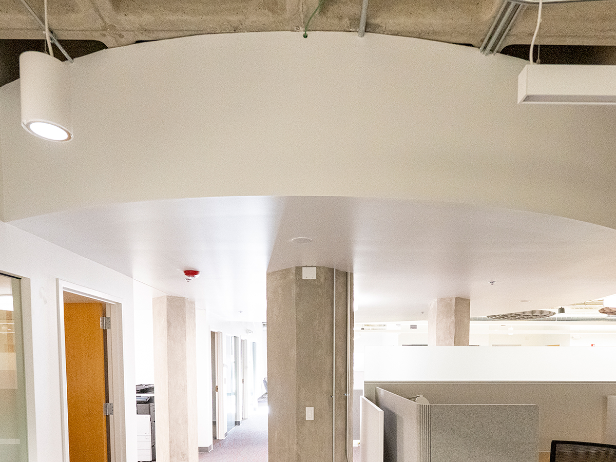
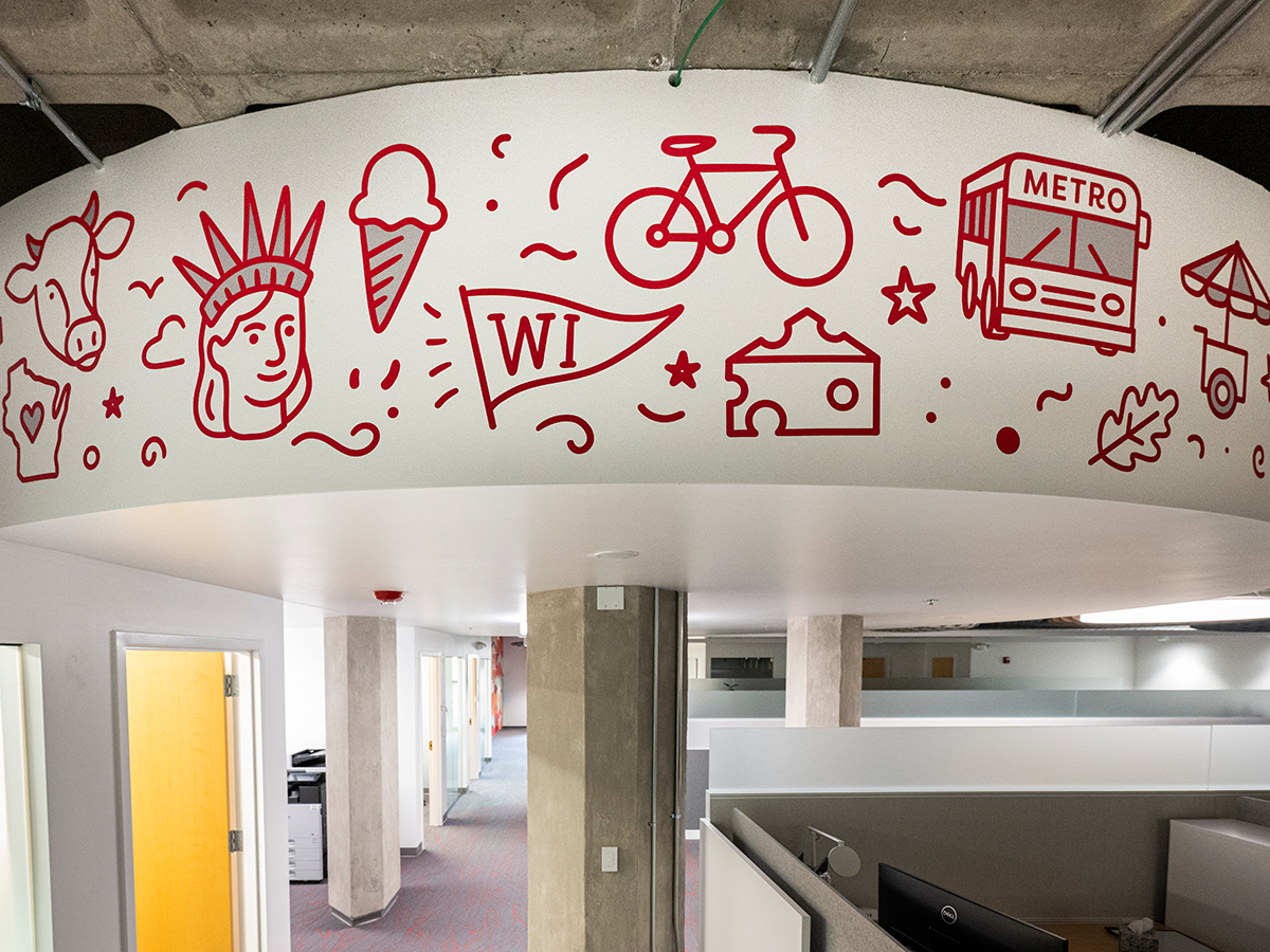
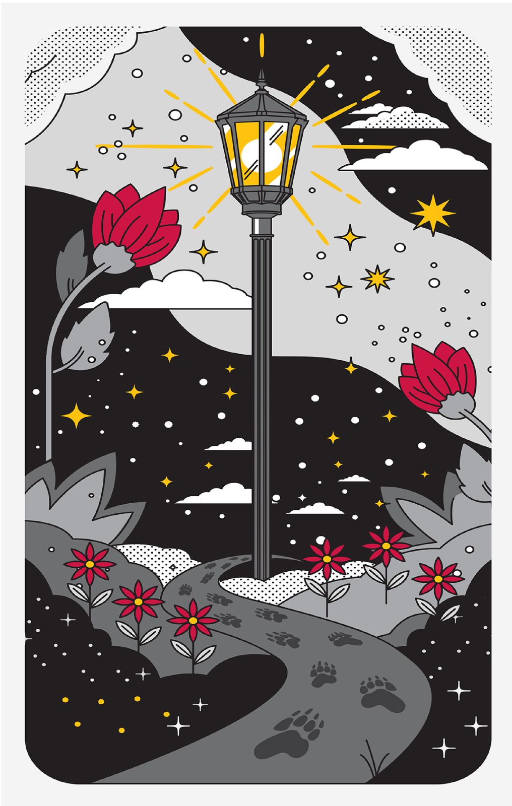
The circle feature
A central architectural feature became a canvas for a more human, expressive approach. Doodle-style graphics contrast with the surrounding geometry, introducing movement and approachability into the space.
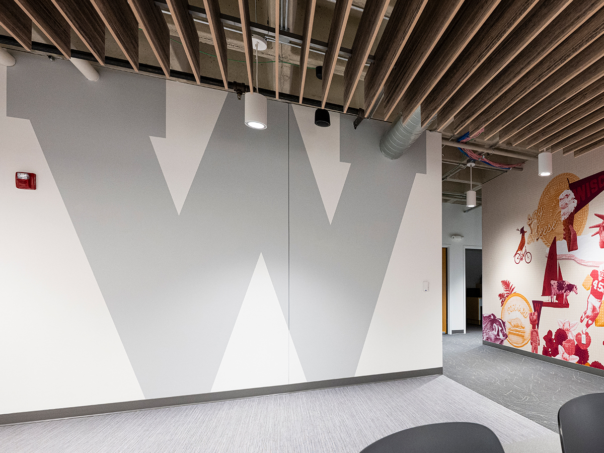
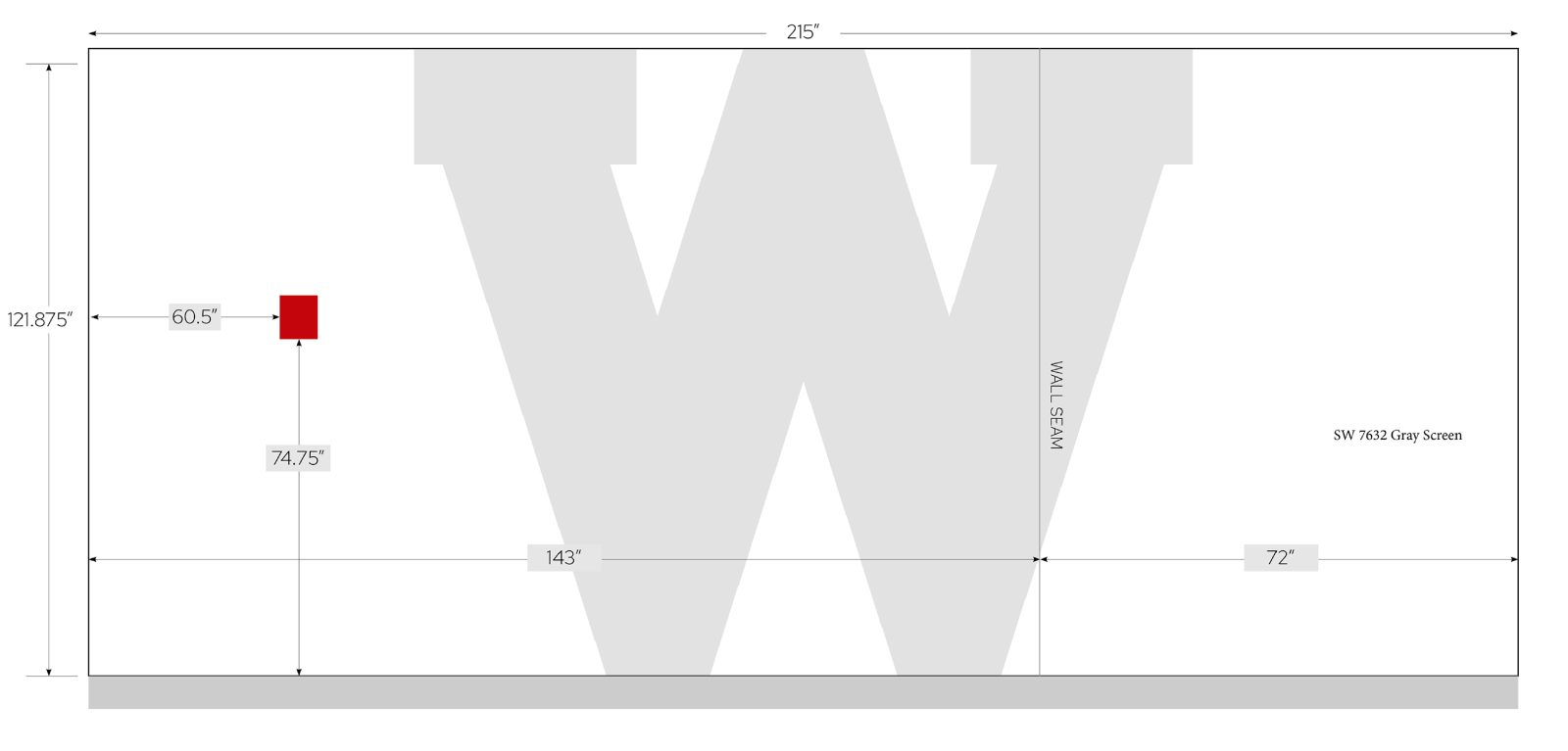
The magnetic W wall
A large vintage W, applied with magnetic paint, anchors a major thoroughfare. At the same time we reinforce brand identity (that is one huge W), we also create an area to display Polaroids taken by team members. This interactive element encourages team engagement, camaraderie, and a sense of play.
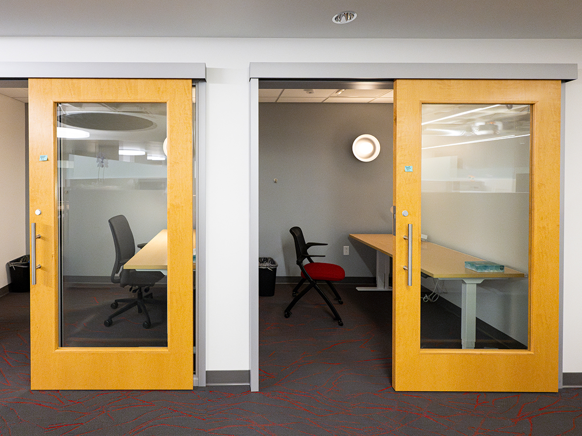
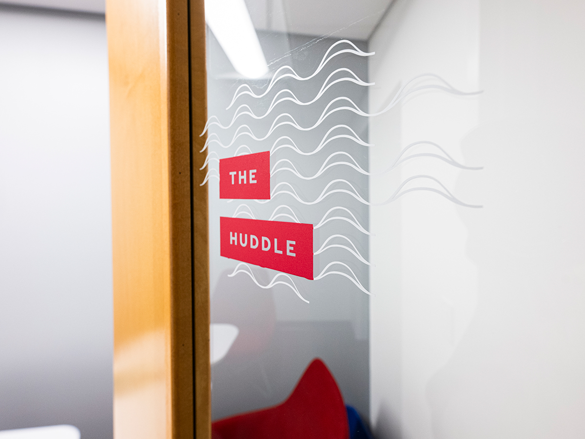
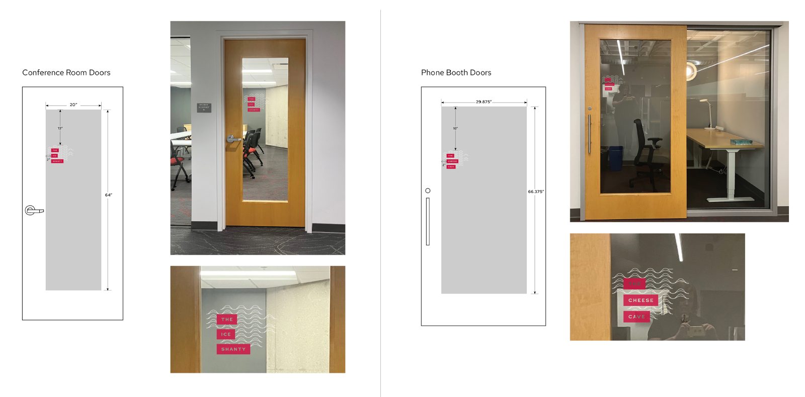
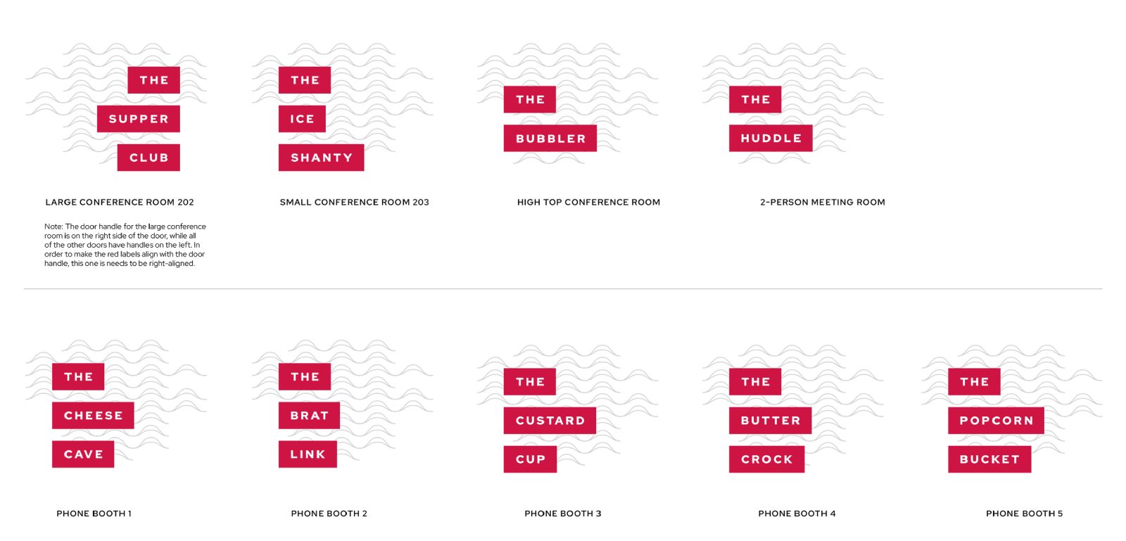
The conference and meeting rooms
Focusing on “wit and Wisconsin,” we named conference and meeting rooms after beloved Wisconsin items — foods, places, and cultural touchpoints. Memorable, iconic, and playful, they help us hit the sweet spot that sings Wisconsin. The design applies brand color blocking and graphic elements for consistency, keeping things cohesive in the space and on brand.
The lessons
Clear strategy matters more than a large budget
This flexible “zone” model shows how institutional brand environments can support diverse working styles and personalities while remaining visually cohesive and not breaking the bank.
In-house talent is a multiplier
This project relied on the team’s ability to balance cost, creativity, and execution, translating brand strategy into a physical space efficiently and effectively.
Constraints are part of the deal
Some things just cost money. And there were lots of ideas we had that just didn’t make the budget (living plant wall, anyone?). But working within constraints pushed the work to be sharper, more intentional, and more resourceful.
And trust is priceless
Could this work have been outsourced? Yes. But this project demonstrates the value of in-house creative — deep brand knowledge, strategic alignment, and the ability to translate UW’s identity into lived experience. Leadership trust made that possible.


Our office now functions as a living expression of the UW–Madison brand, one that supports the team in both creating and experiencing the brand daily. It’s where we work — and where the brand works, too.