Need inspiration? This gallery showcases both the power and flexibility of the UW–Madison brand. Aligning your work with the brand provides the instant recognition and credibility of a world-class institution — and still allows lots of creative space to differentiate your campus unit.
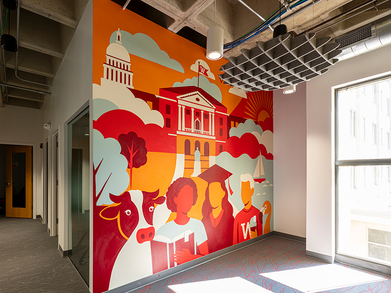
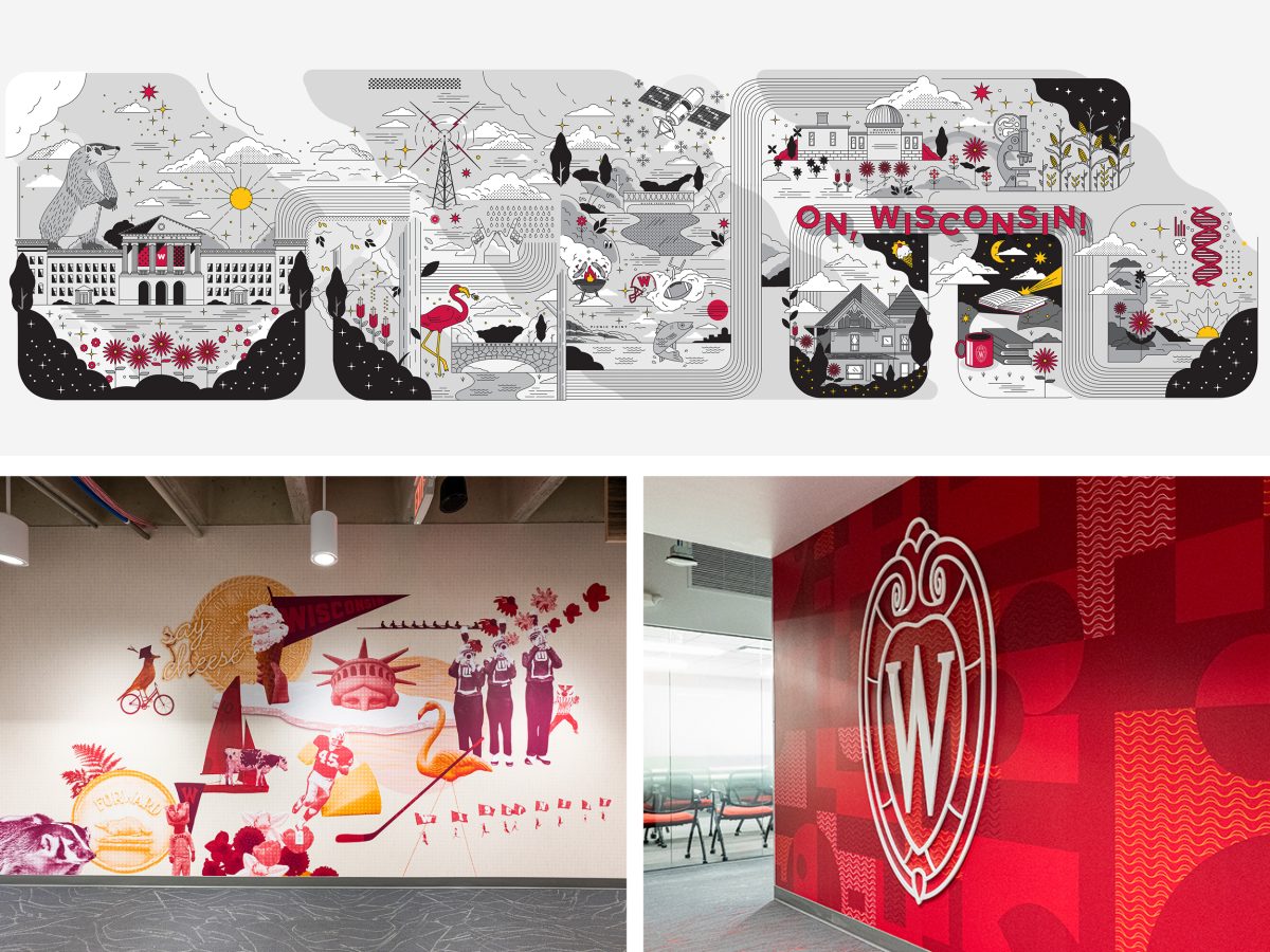
Branded Workplace Design
This case study reveals how Strategic Communication transformed an ordinary office into an immersive branded environment through smart design, room names that evoke a sense of place, and a group-painted mural. The project earned a Platinum Award at the 2026 Hermes Creative Awards.
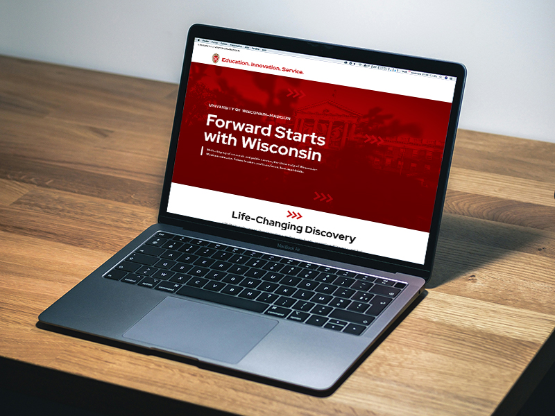
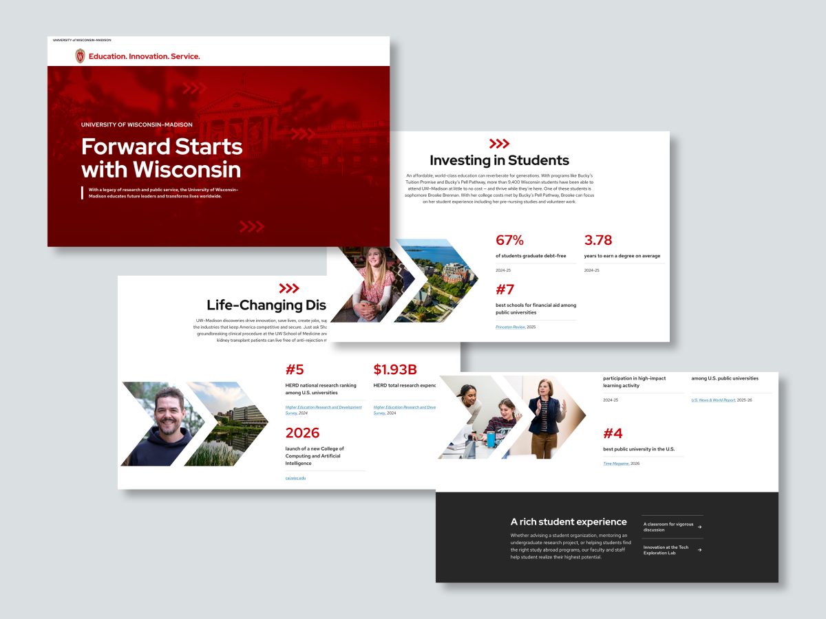
Marketing Campaign Assets
This integrated campaign advances UW–Madison’s peer reputation through a strategic mix of platform-spanning content. Built from a unified creative brief, it pairs cohesive messaging with a distinctive visual identity to reach key higher education audiences and reinforce that Forward Starts with Wisconsin.
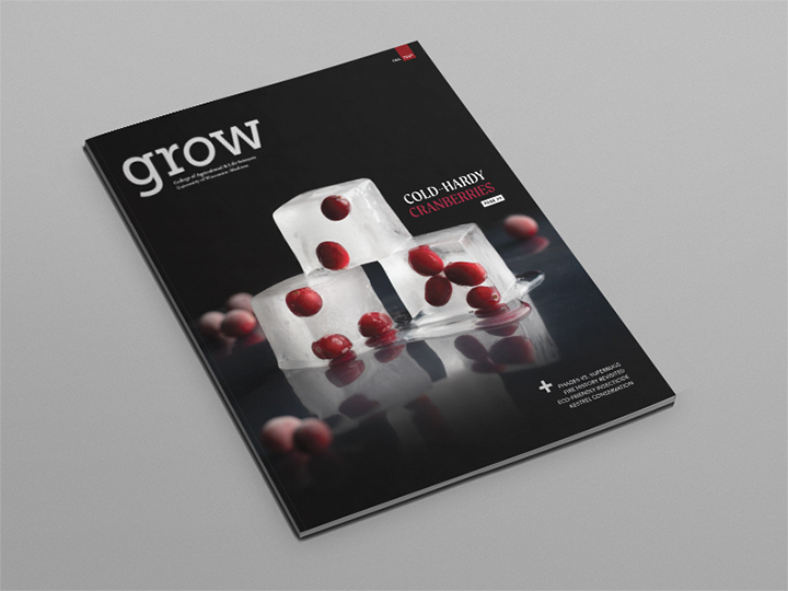
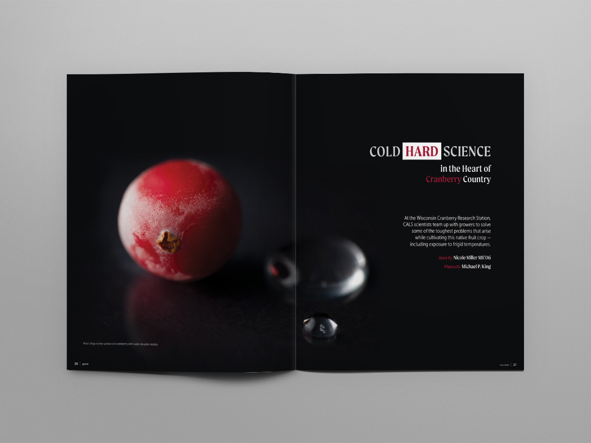
Research Magazine Cover Story
This Grow magazine feature reveals how UW scientists work with growers to solve big cultivation challenges facing one of Wisconsin’s native fruit crops. Its custom photography illustrates the impact of climate change and altered freeze/thaw cycles in an engaging and dramatic way. The cover earned a first-place award from the University Photographers’ Association of America.
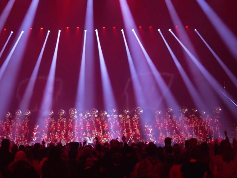
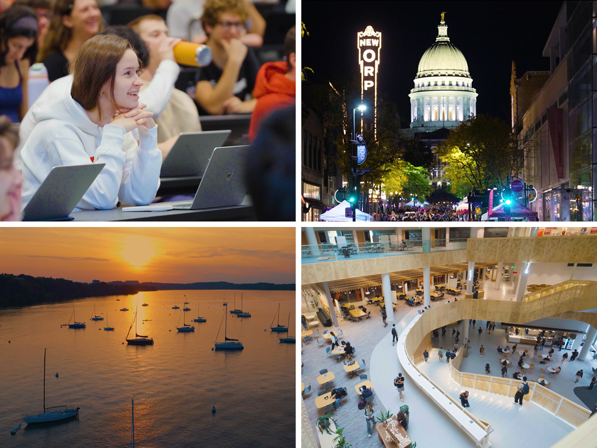
Still/Moving Video
How do you measure a year? In visuals, of course! StratComm’s annual visual story package of the past year lives up to its name by featuring stunning, vibrant imagery — like this compilation video that roars with campus energy.
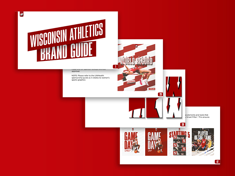

Wisconsin Athletics Brand
Wisconsin Athletics’ refreshed brand guide contains equal parts creativity and clarity, with platform, messaging, a visual system, and design elements that are thoughtful and dazzling. The effect is both usable and inspiring.

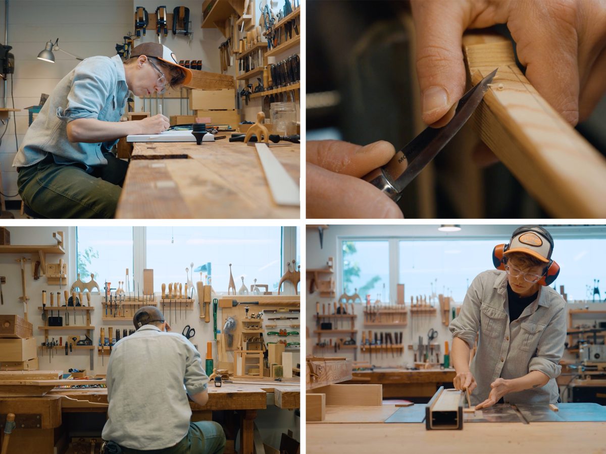
Hudnall Woodworking Video
Cinematic storytelling and striking motion graphics converge in this feature video created for On Wisconsin magazine. Together with polished prose, the effect is to draw reader into the heart of UW–Madison’s vision. It’s a dynamic, on-brand experience that not only shows transformation but also makes you feel it.
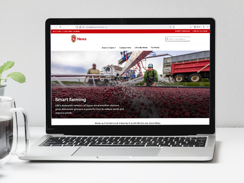
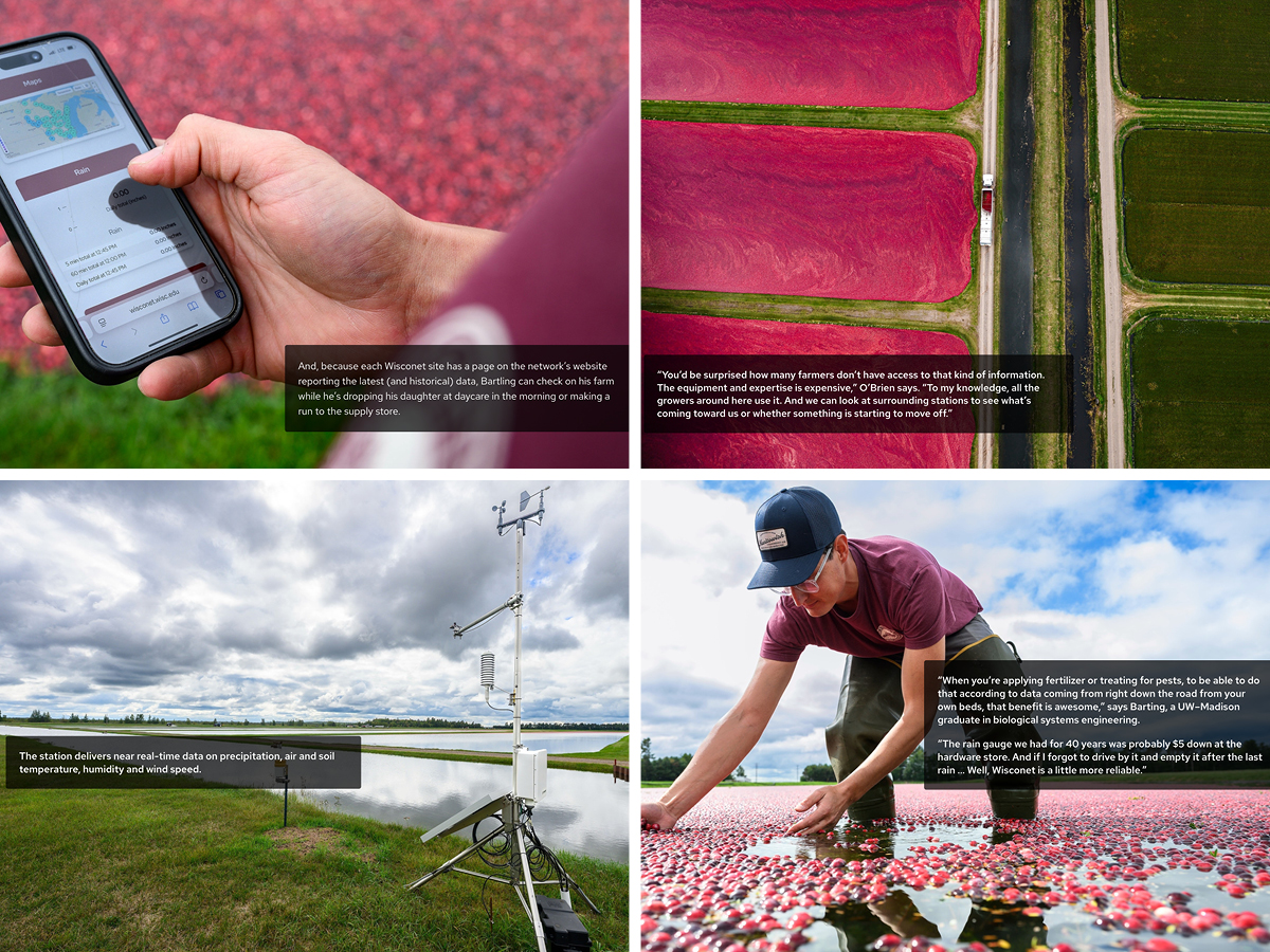
Wisconet Story
Clear writing, smart layout, and thoughtfully composed photo and video elevate a statewide network of weather stations into “Smart Farming,” a cohesive narrative that engages audiences and clarifies the stakes.

Alzheimers NIH Story
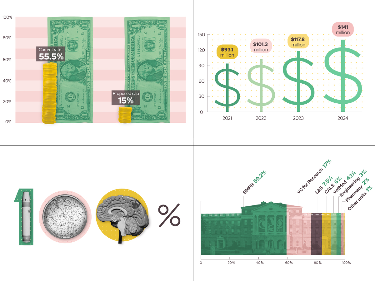
Research meets design excellence: our latest feature on “The Real Costs of Research Funding Cuts” shines with bespoke infographics, on-brand storytelling, and striking graphic design. Every section is crafted to engage, inform, and reflect UW’s identity. The effect? Information that’s as visually compelling as it is thoughtfully written.

Growing the Future Story
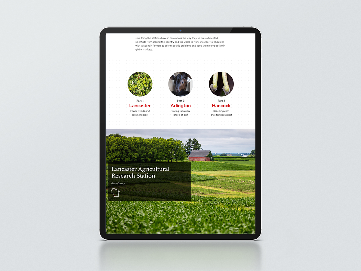
Rich visuals and grounded, accessible writing bring UW–Madison’s agricultural research stations to life. The story captures the people, places, and progress behind Wisconsin’s farming future, where innovation grows alongside tradition.
Alumni Magazine Feature
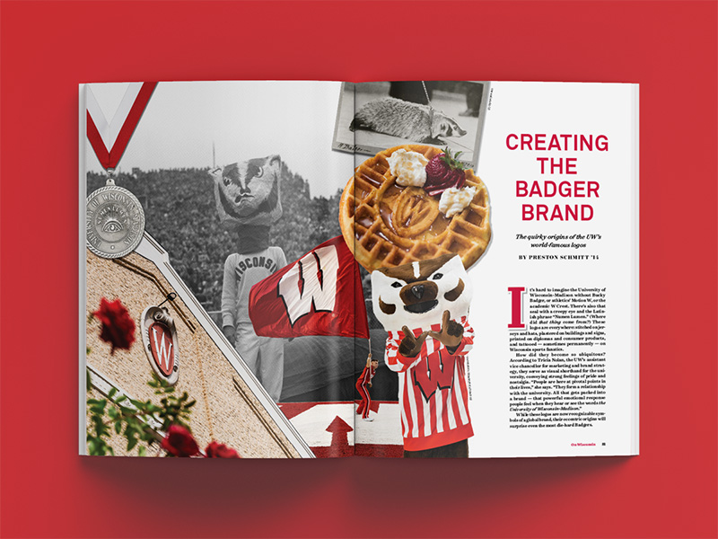
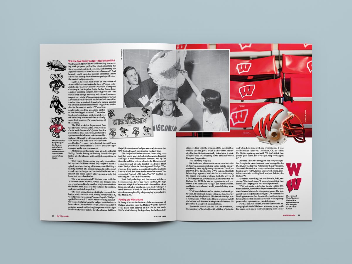
Appearing in On Wisconsin magazine, “Creating the Badger Brand” shares the surprising history of the UW’s world-famous logos with engaging narratives and a mix of archival and contemporary images. The story earned Milwaukee Press Club awards for both writing and design.

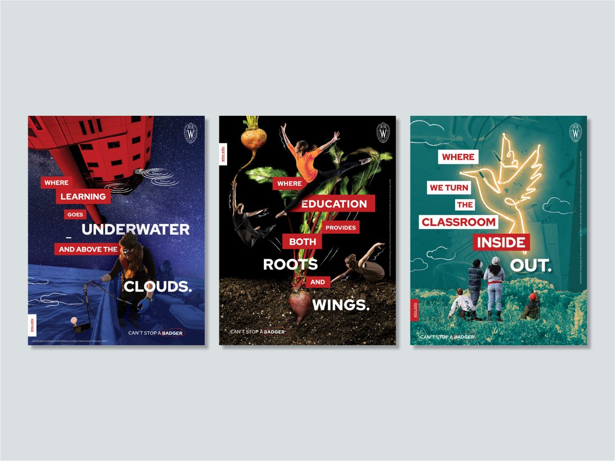
Institutional Ads
The “Can’t Stop a Badger” print ad series tells a story of the UW’s vast educational opportunities through thrilling juxtaposition. Creative photo treatment, illustration, and word play are paired with brand fonts, colors, and graphic elements. The effect is to create a distinctive set of ads that are still unmistakably UW–Madison.
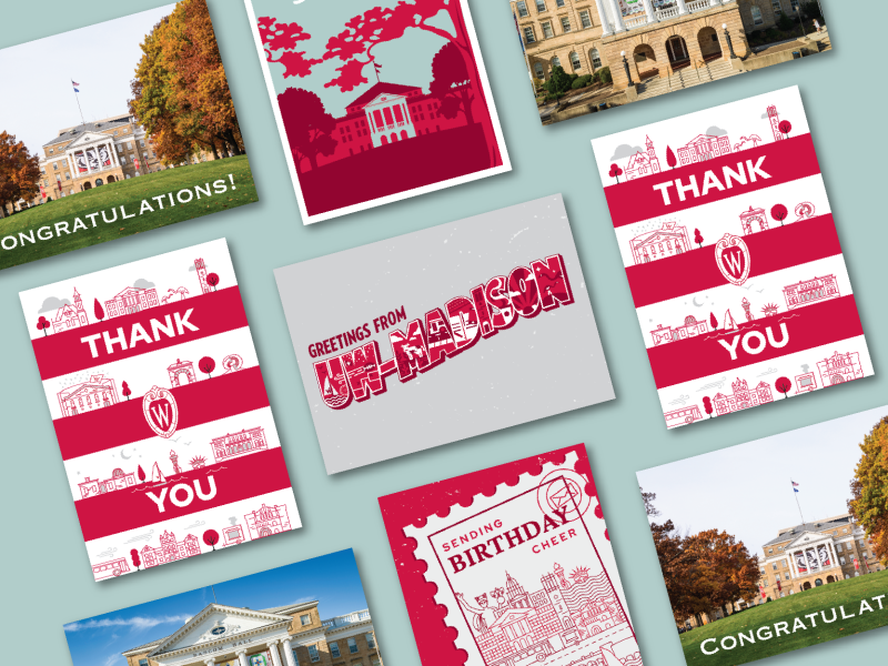
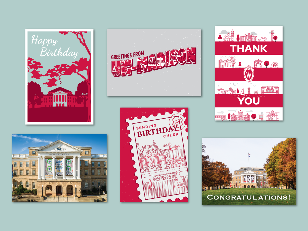
Greeting Cards
The Office of Strategic Communication designed a set of branded greeting cards for the Office of the Chancellor. They feature iconic university imagery alongside playful branded elements, providing the perfect canvass for thank-you notes, birthday wishes, and congratulatory messages.