Need inspiration? This gallery showcases both the power and flexibility of the UW–Madison brand. Aligning your work with the brand provides the instant recognition and credibility of a world-class institution — and still allows lots of creative space to differentiate your campus unit.
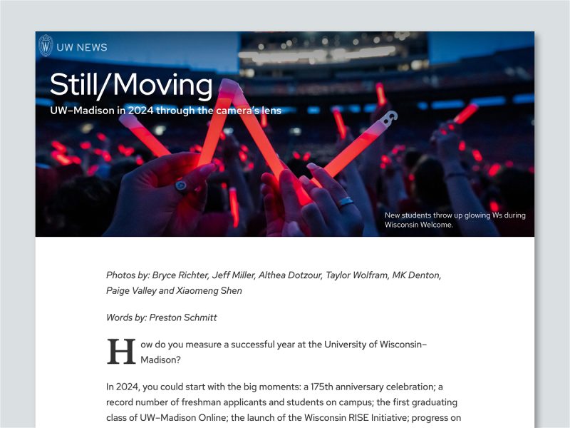
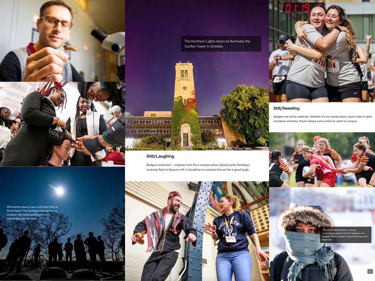
Still/Moving Photo Essay
An annual tradition with a new name, Still/Moving is the story of the past year at UW–Madison told through the photographers’ lens. We aim to engender pride in the UW with striking imagery and an on-brand visual story that’s emotionally resonant and affecting. It’s easy to capture the essence, beauty, and inimitable vibe of UW–Madison with images like these!
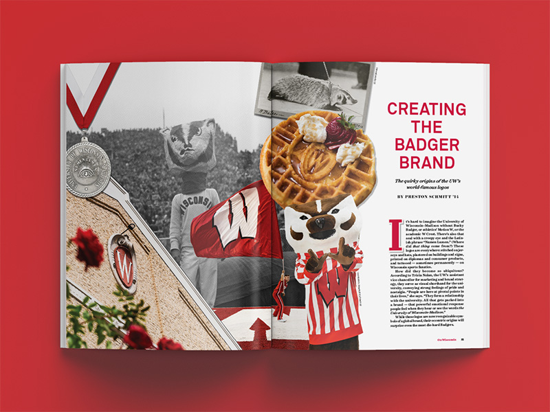
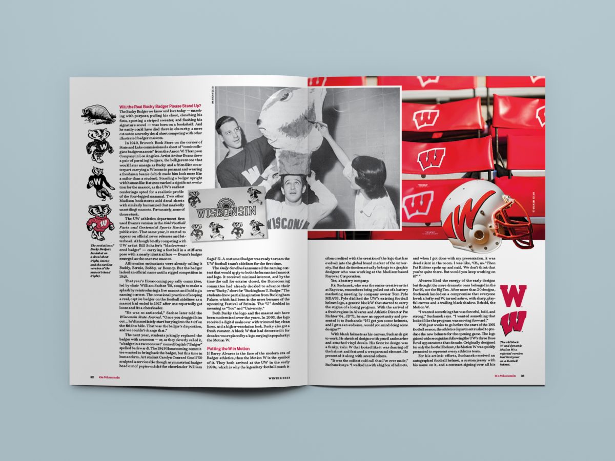
Alumni Magazine Feature
Appearing in On Wisconsin magazine, “Creating the Badger Brand” shares the surprising history of the UW’s world-famous logos with engaging narratives and a mix of archival and contemporary images. The story earned Milwaukee Press Club awards for both writing and design.
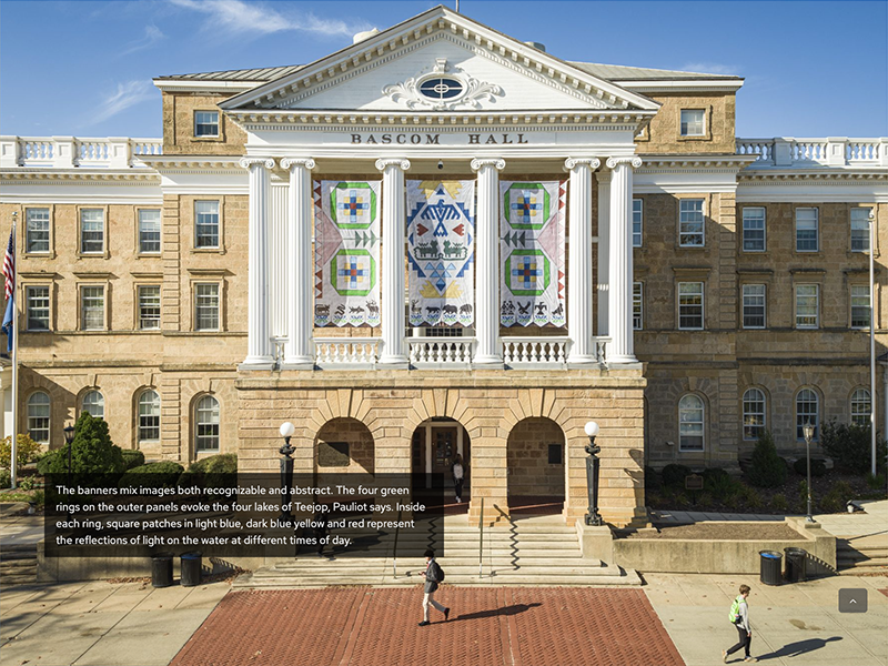
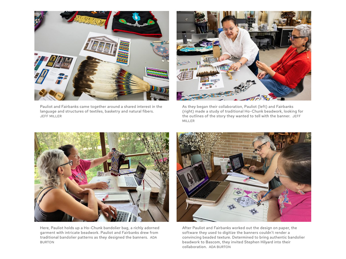
“Seed by Seed” Story
To pay tribute to the new Bascom Hall banners featuring traditional Ho-Chunk imagery, the Office of Strategic Communication produced an elevated news story titled “Seed by Seed” that beautifully weaves words and images.
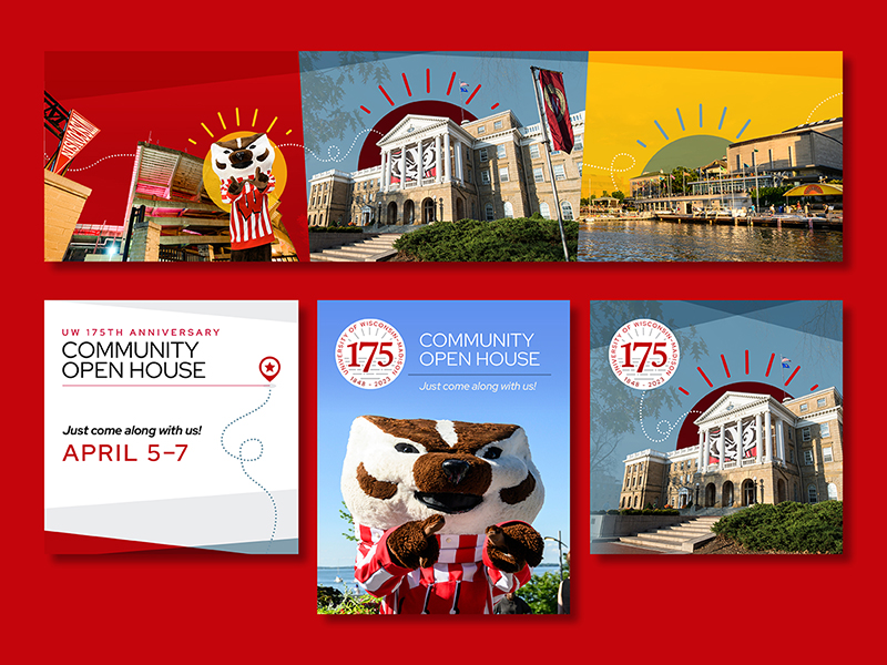

175th Anniversary Open House
The Community Open House, a series of events continuing the university’s 175th anniversary, align with and build from 175th visuals to create a vivid, energetic vibe. Travel iconography and messaging promising “the ultimate campus experience” create a sense of fun and excitement to close out the demisemiseptcentennial.
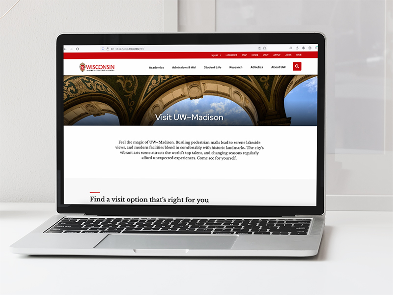
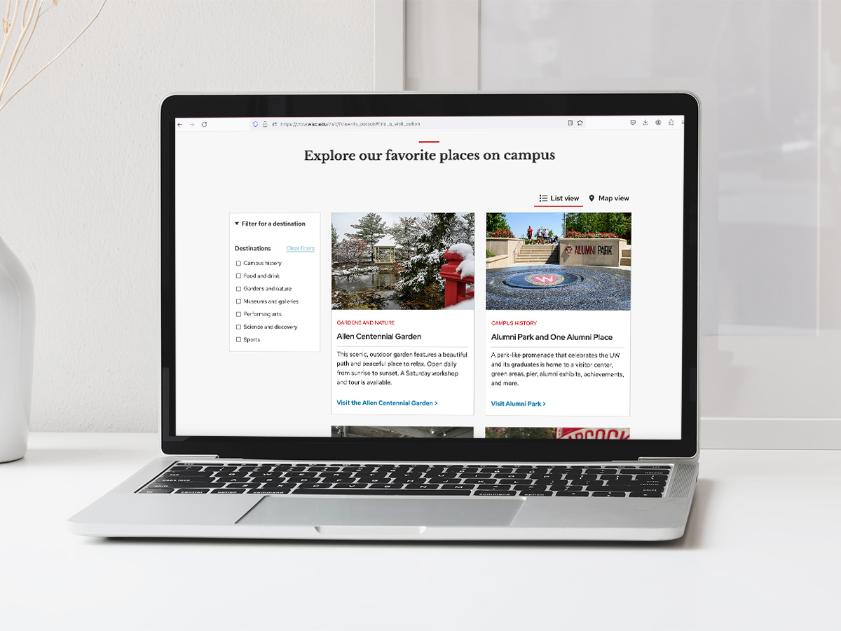
Visit UW Web Page
The Office of Strategic Communication refreshed the Visit UW–Madison web page with dynamic content. Easily navigate and review all of the university’s in-person and virtual tour options, or explore a curated gallery of popular campus destinations. It’s a one-stop shop for prospective visitors!
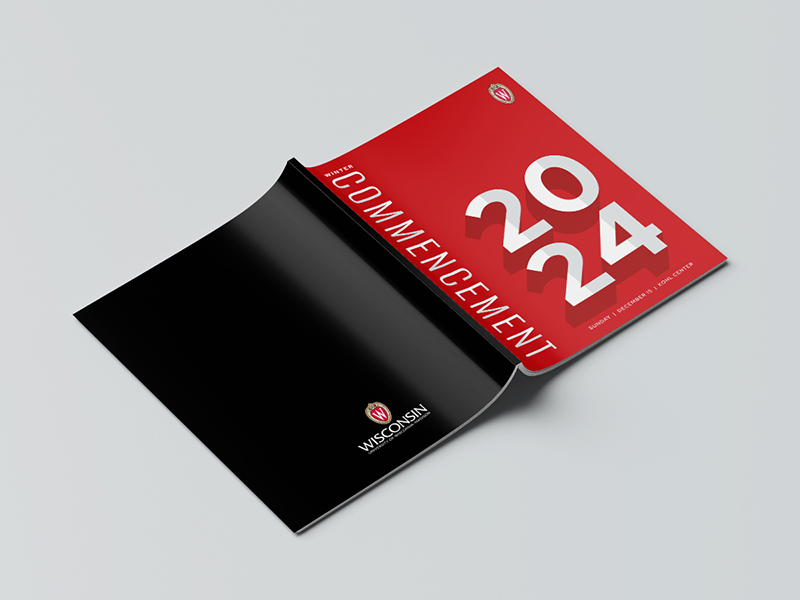
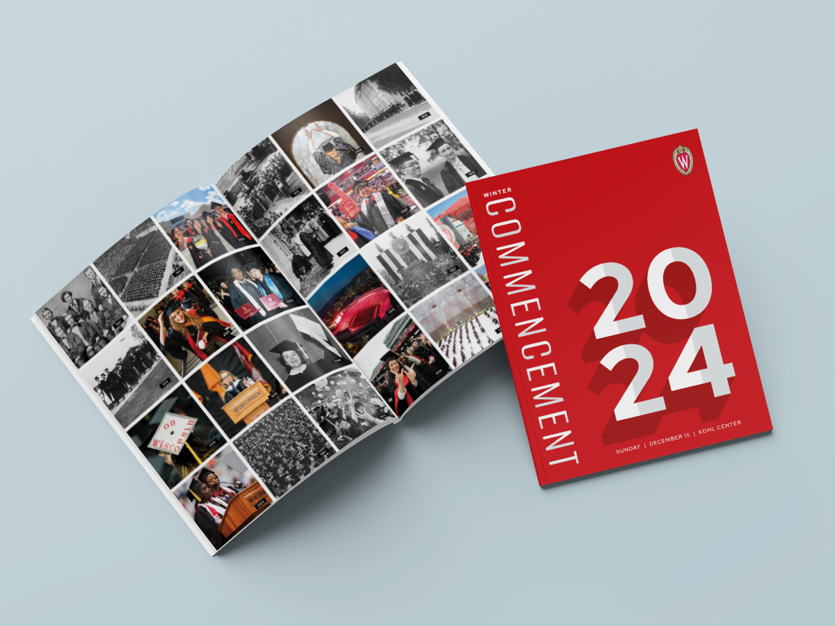
Commencement Program
The Office of Strategic Communication’s rebrand of UW–Madison’s commencement was inspired by — and aligns with — the overall UW brand. Through the concept of a countdown to commencement and ingenious nods to academic regalia, the updated commencement brand is flexible for use with different audiences. The event program design uses these elements to striking, yet polished effect.
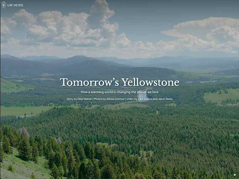
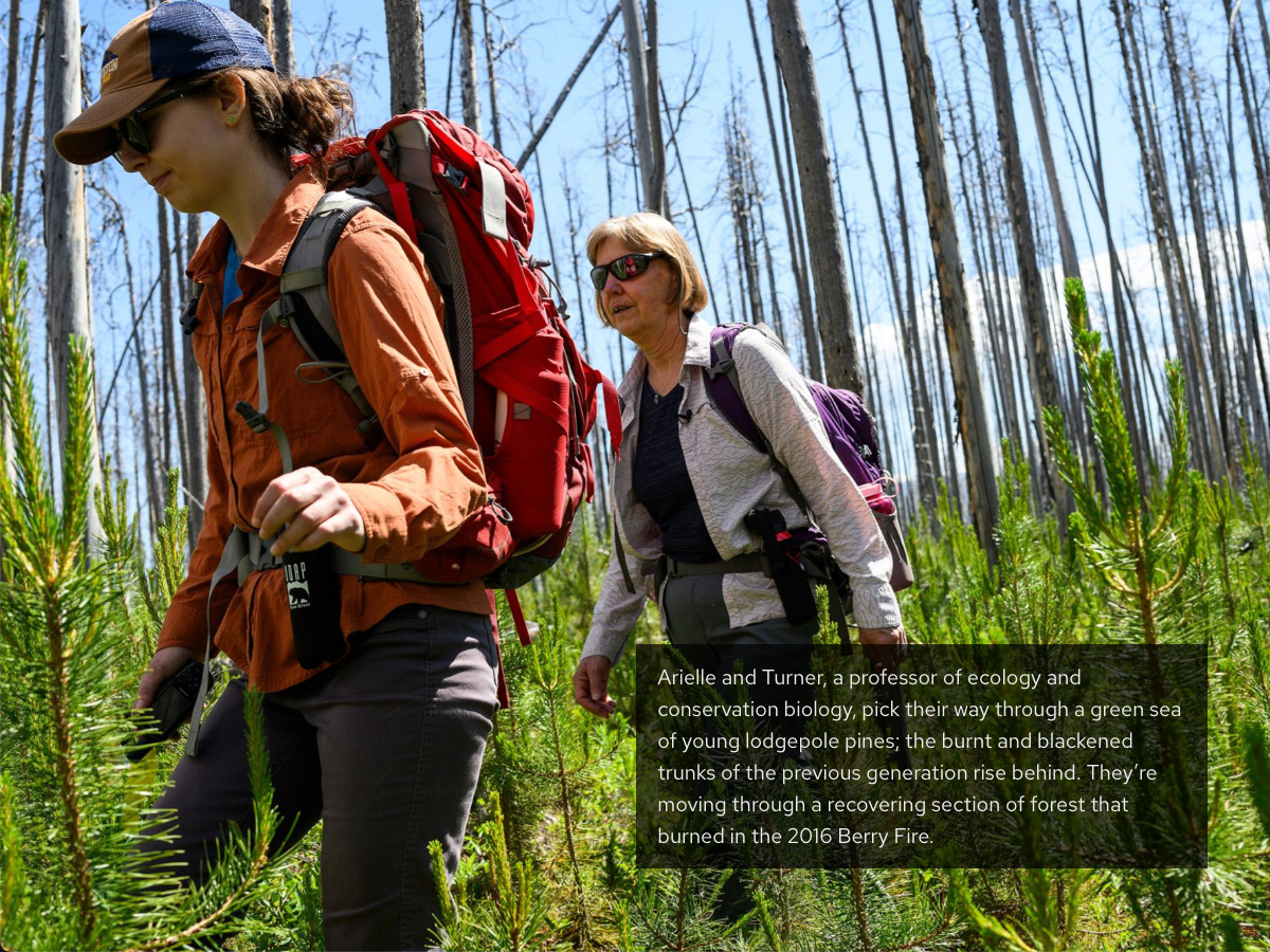
“Tomorrow’s Yellowstone” Story
Tomorrow’s Yellowstone, a UW News story package produced by the Office of Strategic Communication, combines stylistic writing with striking visuals to highlight research on how one of the world’s most beautiful ecosystems is being altered by climate change.
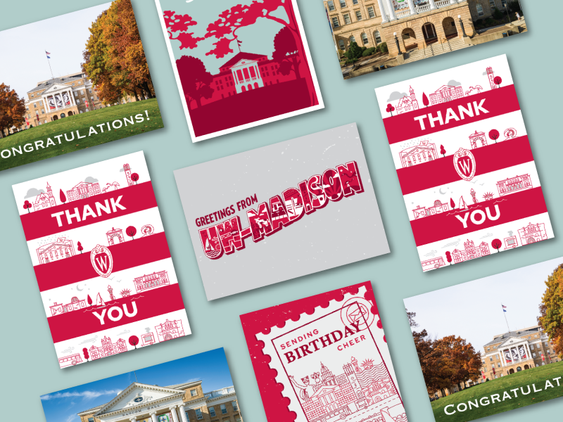
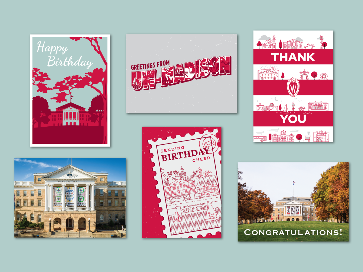
Greeting Cards
The Office of Strategic Communication designed a set of branded greeting cards for the Office of the Chancellor. They feature iconic university imagery alongside playful branded elements, providing the perfect canvass for thank-you notes, birthday wishes, and congratulatory messages.
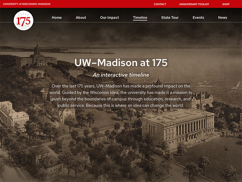
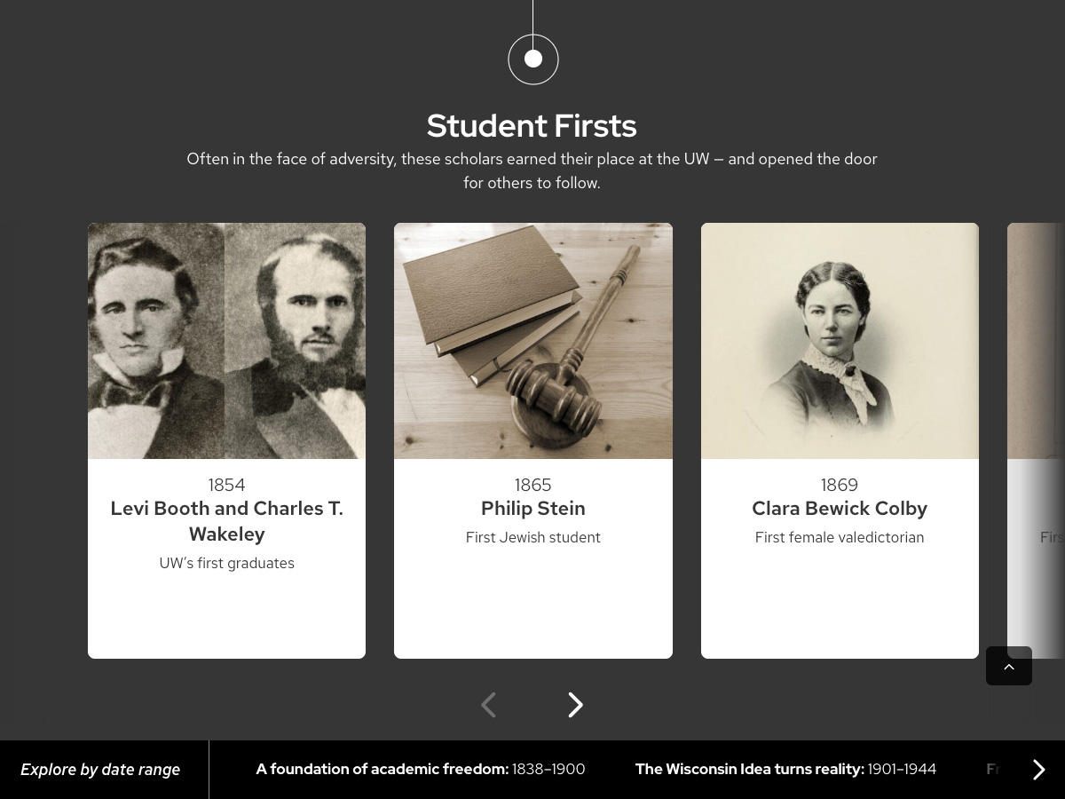
175th Anniversary Timeline
The “UW–Madison at 175” interactive timeline, produced by the Office of Strategic Communication to anchor the 175th anniversary website, brings together crisp writing, archival research, and an engaging design to show how the UW has changed the world.
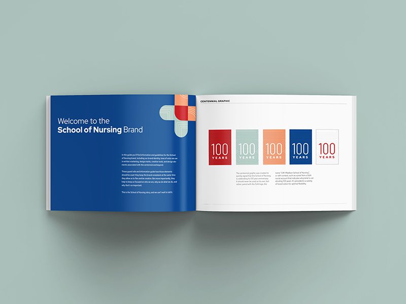
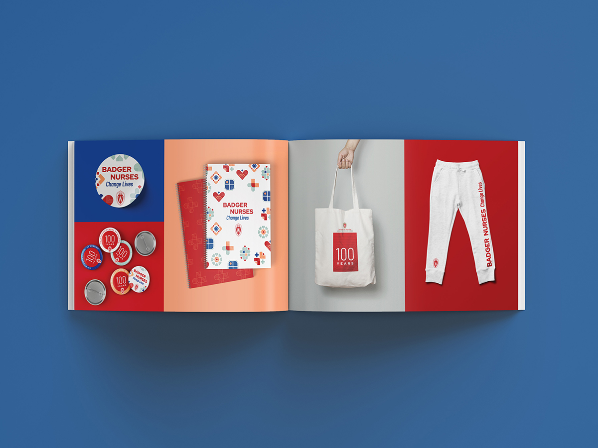
School of Nursing Rebrand
UW’s School of Nursing rings in their centennial year with a fresh, inspired plan for visuals and messaging. Custom visuals for specific research areas provide each with distinction, while still aligning with the greater ecosystem of the SoN brand. And the creation of a modular messaging system allows for maximum usability far beyond a single year.
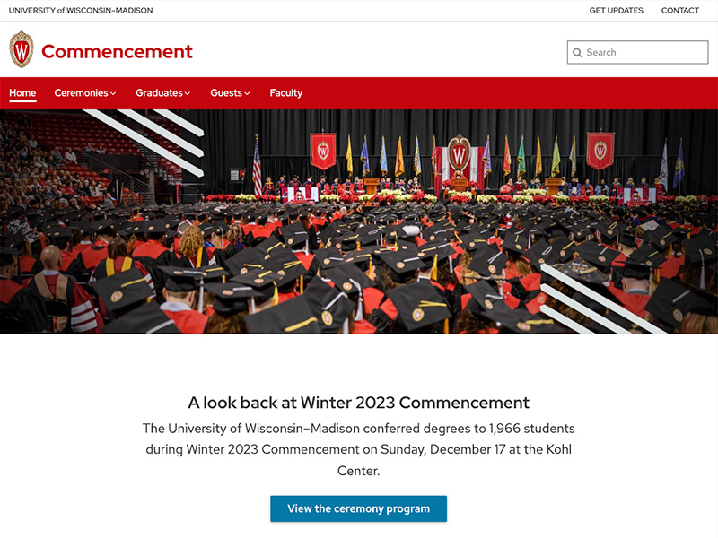

Commencement Website
The new commencement website, a collaboration between the chancellor’s office and the Office of Strategic Communication, combines two previous sites into a visually appealing, easily navigable, and fully informative source for new graduates and their families.

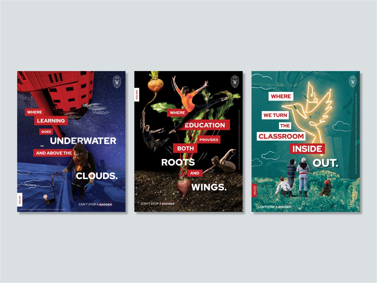
Institutional Ads
The “Can’t Stop a Badger” print ad series tells a story of the UW’s vast educational opportunities through thrilling juxtaposition. Creative photo treatment, illustration, and word play are paired with brand fonts, colors, and graphic elements. The effect is to create a distinctive set of ads that are still unmistakably UW–Madison.