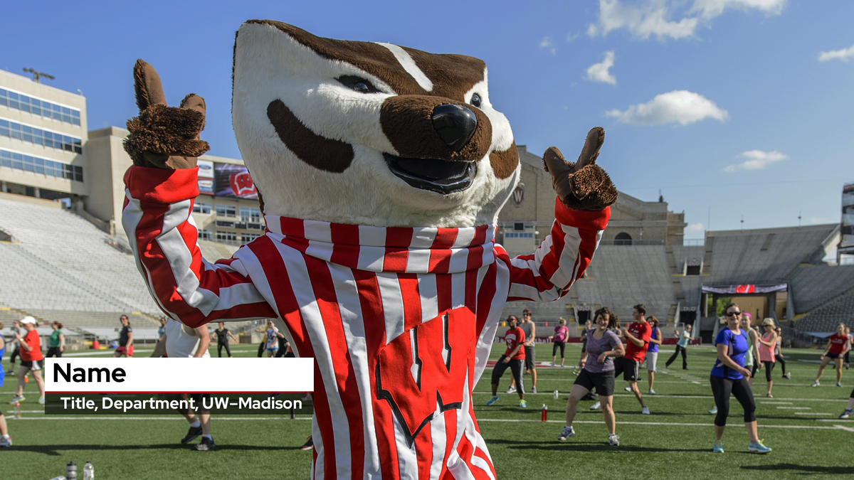
When producing a video, you can use a lower third overlay to add speaker names and other identifying information. Using a lower third gives your video a professional, branded look and ensures that your text is readable and not overly distracting on screen. This bundle includes single and multiline lower third templates in horizontal and vertical orientation. Gray and transparent colors are available.
How to use lower thirds
To use these templates, you will need to have Adobe Creative Cloud and the Red Hat Display font on your computer.
Using Adobe Premiere Pro
If you are using Adobe Premiere to edit your videos, you can easily utilize the MOGRT files to add this self-adjusting graphic to your horizontal video projects. Once you have placed this on your timeline, you will see several options appear in the Edit tab of the Essential Graphics window. As you add your text, the length of the bar will adjust automatically to fit. The bar animates on and fades off. You can also adjust the duration of the graphic from four to 12 seconds as well as select between HD and 4K. If asked to adjust your sequence settings, select Keep existing settings.
To import a MOGRT file, first locate the Install Motion Graphics template button in the lower right corner of the Essential Graphics window. You can then drag the template into your sequence. Add as many of these as needed. When you select the MOGRT on your timeline, you can then use the Edit tab in the Essential Graphics window to modify the graphic. If you have never used a MOGRT file before, Adobe has a detailed guide along with some video tutorials to help you get started.
Using Adobe Photoshop
If you are using another editing program, you can export a PNG file using the Photoshop templates. The templates are HD by default or 1920 x 1080. If you are editing in 4K, open the PSD file, go to Image > Image Size and change the dimensions to 3840 x 2160. The graphics were created large enough to scale without distorting.
Once you have modified the text, adjust the background bar to be slightly longer than the longest line of text. Try to create the same spacing on the right side of the bar as on the left by dragging the right side of the bar to the desired length. One way to do this is to first select the Bar layer in the Layers window. Then go to Edit > Free Transform. Ensure the Maintain Aspect Ratio button is unchecked (Link icon between the H and V percentages that will appear in the top bar). This will allow you to drag the right side of the bar without effecting the height.
It looks best if the bar ends up a little longer rather than shorter if it isn’t exact.
Helpful Tips
Try to use the transparent option first. If this hinders readability though, the gray option offers a similar look that should work where the transparent does not. Whichever works best, keep the selection consistent throughout your project.
Keep it short. Abbreviate and simplify titles where appropriate. Lower thirds should be quick and informative so that it enhances the story without distracting from it.
Captions tend to end up in the same place as lower thirds. The placement of these has been done to help limit this interference. If you notice an issue, try adjusting the placement.
Related resources


See all resources tagged with: