Sending out an e-newsletter is easy. Sending out an e-newsletter that people actually want to read and engage with? That’s a little harder. But fear not: we’re here to help. Follow our tips below to create an e-newsletter with a clean design and compelling content, regardless of which email marketing platform you use. (And a reminder: Eloqua is a university-supported platform with robust automation capabilities.)
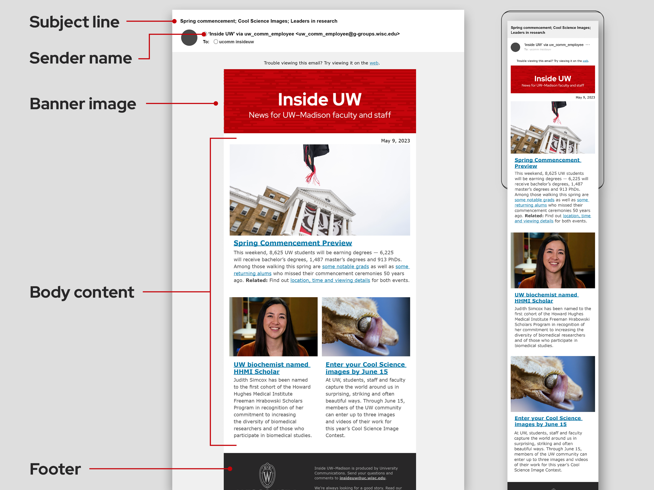
General e-newsletter guidance
- Keep it simple. Long text and busy design elements can be distracting and overwhelming, diminishing audience attention to your overall message.
- Name your e-newsletter. The newsletter name should be unique and capture your unit’s mission (and not just be a repeat of your unit name). Try to be creative and clever but not too abstract or obscure.
- We recommend that you use the Verdana font for the text in your e-newsletter. By using this standardized email-safe font (rather than our normal brand font Red Hat), you ensure that all recipients will be seeing your email design as it’s intended.
- We recommend a minimum font size of 14 pixels for body copy when using Verdana to help with readability.
- Remember that headline font size should be larger to differentiate content hierarchy. In most e-marketing platforms, you can set up font styles for body copy and headers (H1, H2, etc.) to ensure consistency and improve efficiency as you build out your newsletter.
- Make sure that all images in your newsletter include alt text. When you upload an image in your newsletter, fill in the alt text field with short descriptions of the content of the image. This allows screen readers to describe the image for recipients with limited vision.
Subject line and sender name
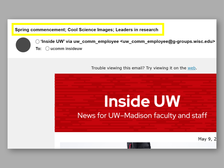
Customize the subject line to your content. The subject line is the first opportunity to compel a recipient to open your e-newsletter. Customize the subject line for each email to highlight the most interesting content from your newsletter. A standard convention is to use the name of your newsletter followed by short teasers.
Keep it brief! It’s best to keep the subject line to fewer than 50 characters. Otherwise, you increasingly risk your subject line being cut off on mobile devices.
Establish your sender name. Customize the sender name in your e-newsletter platform to reflect your official unit name (e.g., UW–Madison Art Department). It should be immediately clear to your audience where the email is coming from.
Preheader
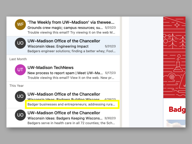
Customize your preheader text. A preheader is the summary text that follows the subject line when you’re previewing an email in your inbox. The preheader will typically default to the first lines of text in the email you’re sending. This can become problematic if the first piece of content in your newsletter is an image or a link to view the email in a browser; in this case, the image’s alt text or the web-link copy could display as the preheader (and look like a preview error to recipients).
Guidance varies, but in general, try to limit your preheader to 80 characters to ensure the full text appears on different email services and devices.
Banner image
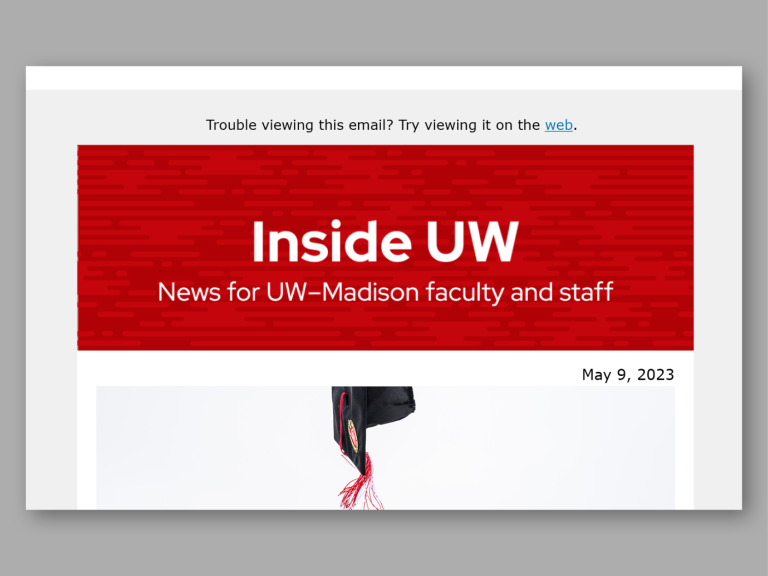
- Include your newsletter name (up to 3 words).
- Provide context by adding a short subhead stating what the email is and whom it is for (5–10 words).
- Because the text within the banner is embedded in an image file, you can keep your banner on brand by using UW brand fonts (e.g., Red Hat Display).
- Link the image to your newsletter website if you have one or to your departmental website if you don’t.
- Your banner image should stay consistent across issues.
Body content
Prioritize your most compelling content
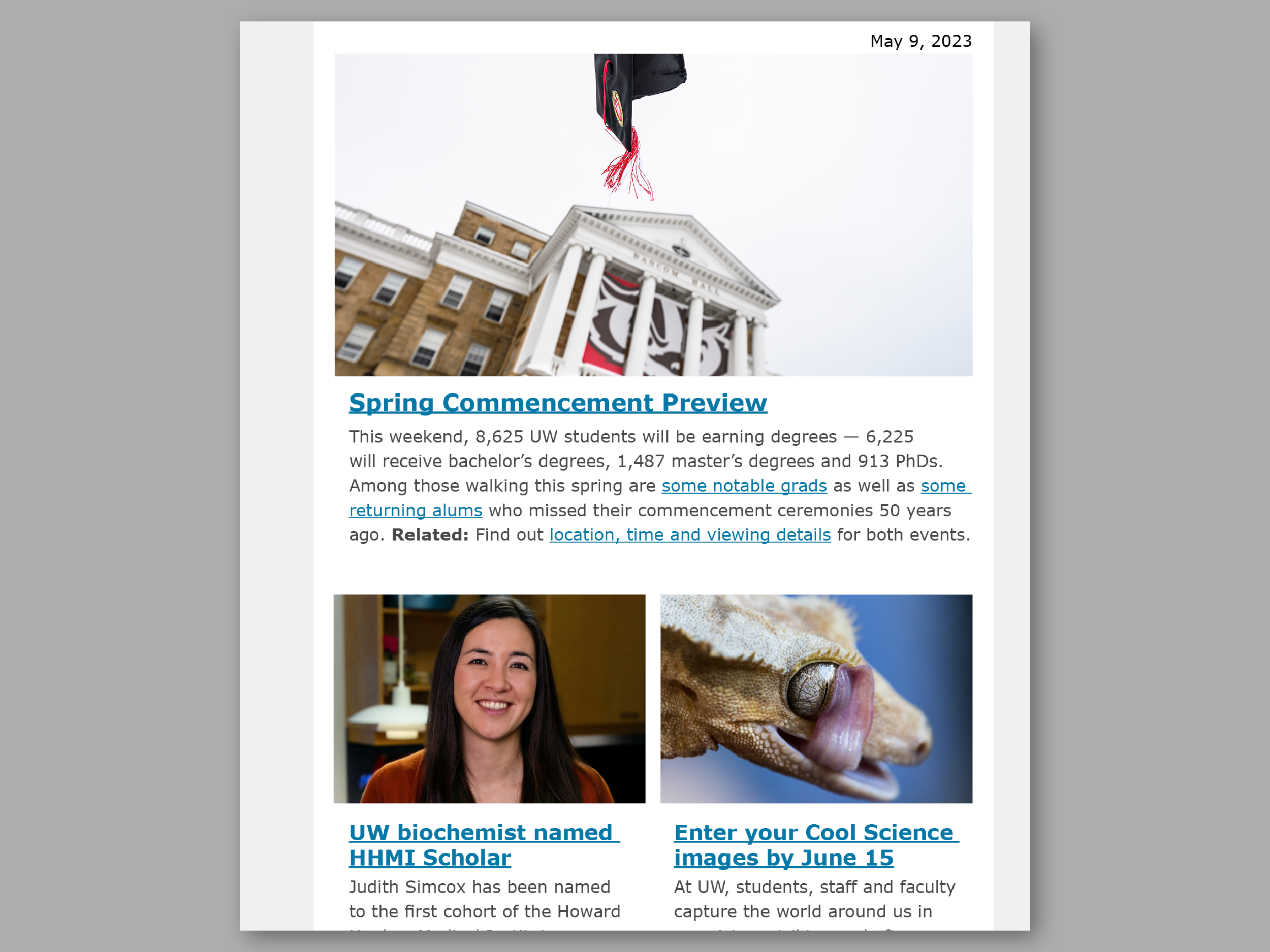
What will your audience find most compelling? Ideally, your first piece of content should be the one with the best combination of news value and visual impact. For this reason, we do not recommend starting with a letter from a leader of your unit.
Write engaging headlines and teaser copy
The teaser text for each story should concisely summarize the content and intrigue readers to learn more. Engagement here is measured by whether they click on the link to the full piece of content.
Link out to the full content
To minimize the length of your e-newsletter and maximize engagement, you should only be using short teaser text to introduce each story/piece of content. You should then link out to the full content.
Measure readers’ engagement with your content
Most email marketing platforms allow you to see email open rates and link click rates. While link click rates are helpful for understanding user engagement with your emails, open rates are no longer accurate since iOS 15 privacy protections were put into place.
Want to know how much traffic your newsletter is sending to your website? Or how long users are spending on your article pages? You can answer these questions by setting up Google Analytics on your website and adding UTM tags to the links in your e-newsletter. UTM tags tell Google Analytics where your website traffic is coming from. This information can help you make important decisions about where to focus your communication efforts.
Footer
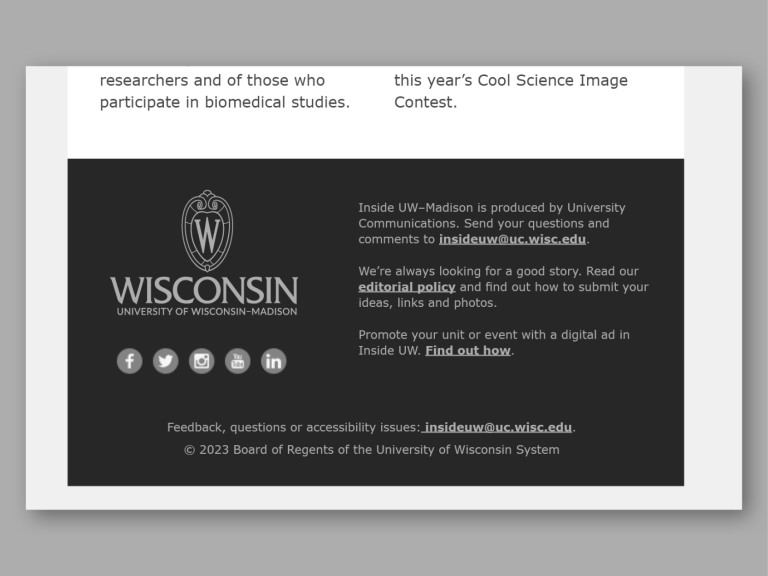
Along with your top banner, the footer of your e-newsletter should stay consistent across issues. Here you can include your official unit logo and contact information. Consider including a short note that explains why the recipient is receiving the email (i.e., subscription status). You may also want to include share and subscribe links.
Note that if your e-newsletter is being sent to any off-campus (i.e., non-wisc.edu) email addresses, it must comply with CAN-SPAM Act rules. This includes a functional opt-out/unsubscribe mechanism. Review more guidance.
